
At LightFi I was Lead UX/UI designer designing dashboards for different end users from scratch. I conducted user interviews with engineers, building managers and building visitors to see what the most important data points would be for them. This was then translated into a simple, easy to navigate dashboard design.

Get your story straight
Before doing any of the UI work it was so important to understand the different user needs and also which devices they would be checking the information on. We got this information by conducting interviews with the different persona types we identified. In this case engineers, building managers and building visitors.
The need for speed
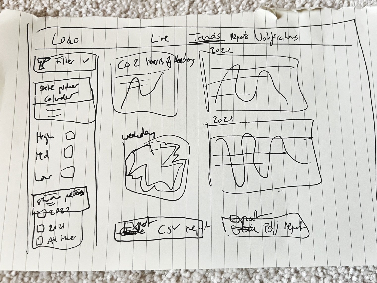
I like to work fast and nibble so I scribble a lot at first.
This means I can get the features down on paper fast and can talk them through with the product team. This safes valuable time and really brings your design thoughts to life.

Know your audience
In the case of the office user, all they wanted to know was the current air quality and if the air might be better on a different floor if it was hot desking. So we kept it really simple for fast information. Sometimes less is more.
In the case of office managers or engineers they needed lots more data points and alerts to manage malfunctions, heat or air quality issues fast. In the case of the engineer they had an extra add on to help them install different kinds of sensors in the buildings.

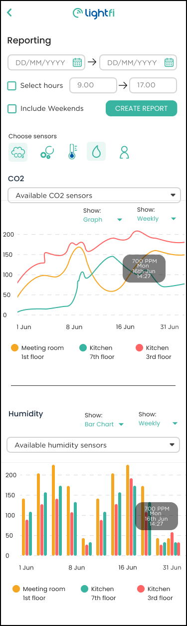
Office managers were also keen to have this data available on the go to quickly create a report of a certain moment in time.
